How To Create The Perfect Spring Planter
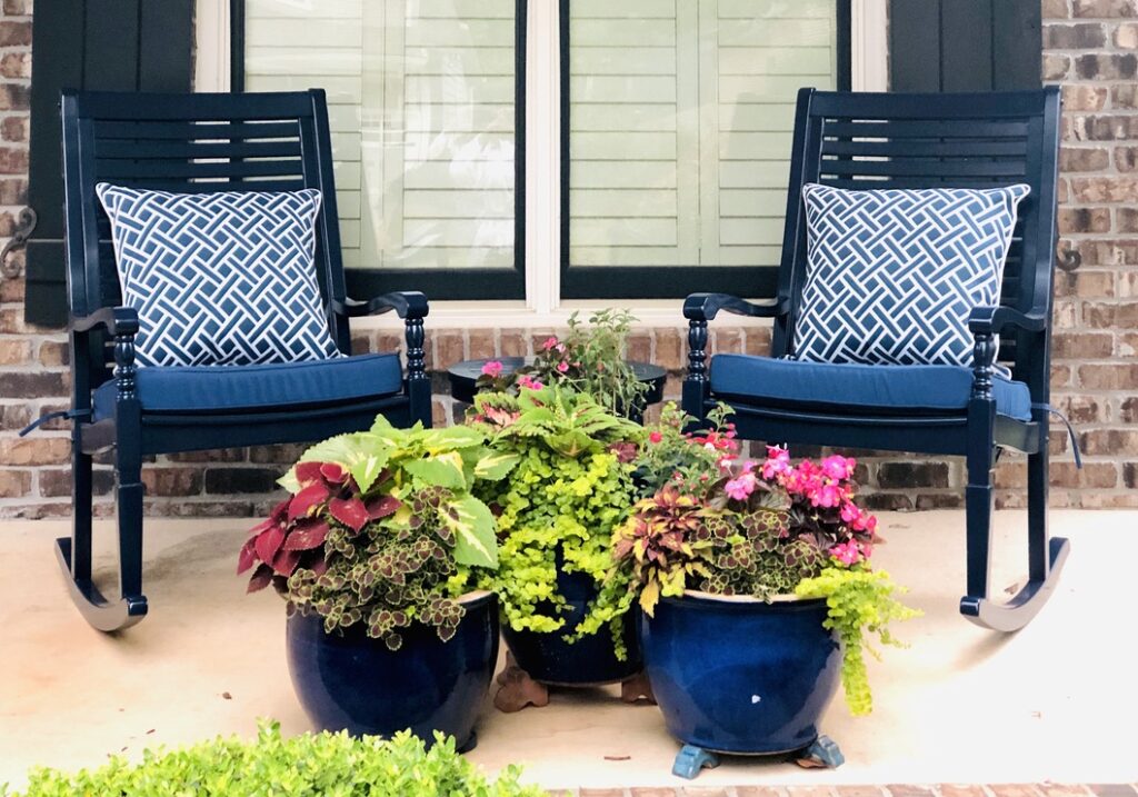
Here’s the thing about container gardening — it’s basically interior design with dirt. Same rules apply: you need layers, contrast, and a little bit of drama. Let’s break it down.
1. Think Thriller, Filler, Spiller
This is the golden rule of container design, and once you know it, you can’t unsee it in every gorgeous porch pot you scroll past.
- Thriller – your tall, show-off plant. It’s the piece that draws the eye first, like a great light fixture in a room.
- Filler – the mid-height plants that bulk things out and keep it from looking sparse. Think coleus, begonias, that kind of lush, leafy volume.
- Spiller – anything that cascades over the edge and softens the pot’s hard line. Creeping jenny is the MVP here in the photo above.
If your planter feels “off” and you can’t put your finger on why, nine times out of ten it’s because you’re missing one of these three roles.
2. Color Isn’t Just Pretty — It’s Structure
I always tell clients this about their homes, and it’s just as true for pots: color is key. Look at a combo like deep burgundy begonias against that acid-green filler foliage. That’s not an accident, that’s contrast doing the heavy lifting. Pair a warm tone with a cool one, or a dark leaf with a bright bloom, and the whole arrangement suddenly reads as intentional instead of random.
3. Don’t Skimp on the Pot Itself
Your container is basically the “frame” for this whole little art piece, so treat it that way. A deep, saturated glaze makes bright florals pop even harder, and it holds up as a design statement even in the dead of winter when nothing’s blooming. Buy the pot you’ll still love empty.
4. Good Soil Is Non-Negotiable
Unsexy tip, but an important one: don’t just cram new plants into last year’s dirt. Fresh potting mix gives your plants the nutrients and drainage they actually need to thrive all season, not just look good for the Instagram photo. Your plants will thank you by not dying in July.
Could you go to the garden center, grab whatever’s blooming, and shove it in a pot? Sure. Will it look like something out of a magazine? Probably not. The difference between a planter that looks like an afterthought and one that stops your neighbors mid-walk is almost always this: layering (thriller/filler/spiller), intentional color, and a gorgeous container.